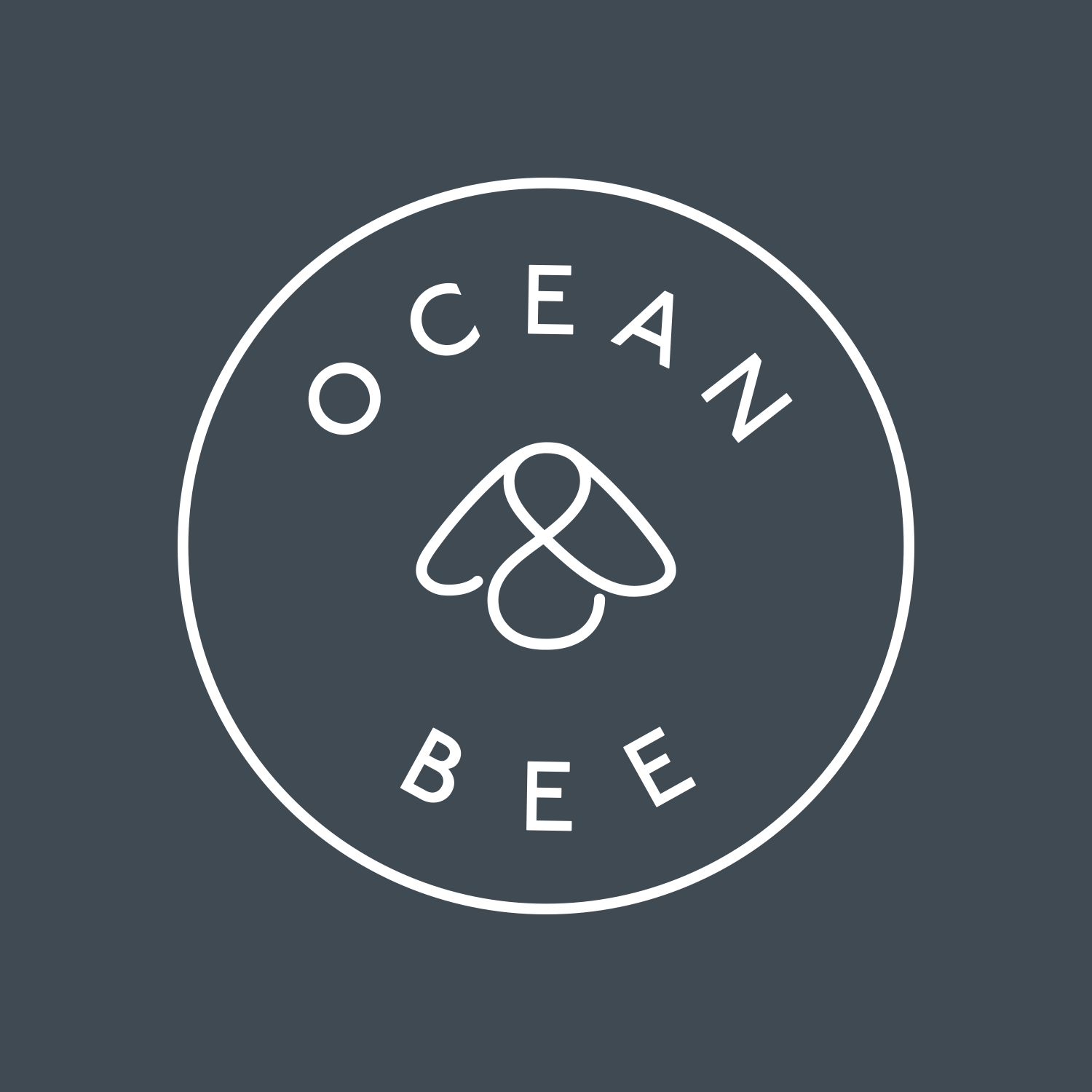
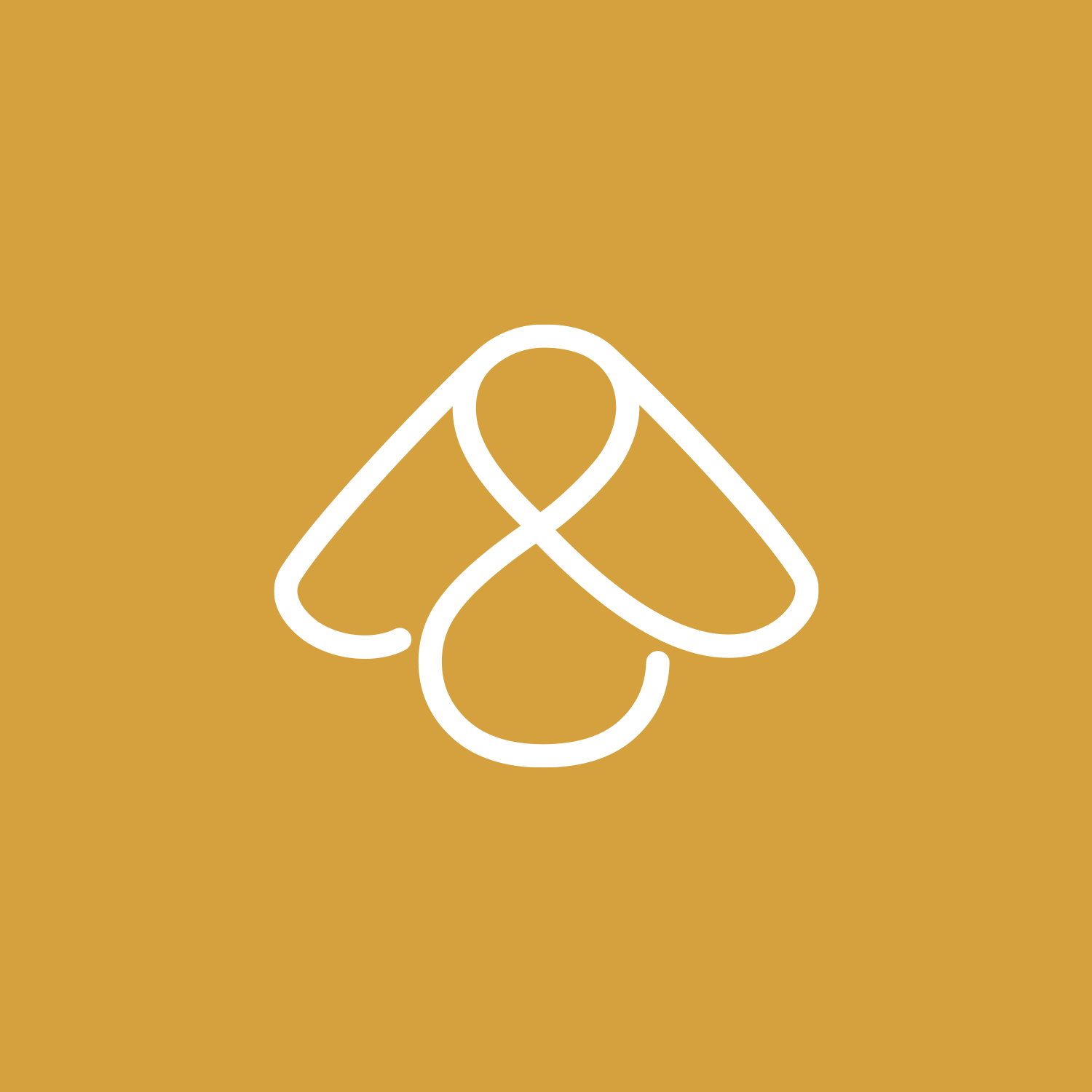

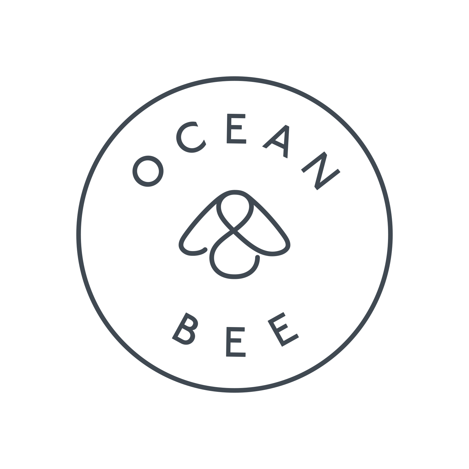
Ocean & Bee wanted a logo for their eco shop that would also work if the brand extended to include their own products. The simple bee shape was chosen as it works well on a banner at the market as well as a tiny bee mark. The shape also reads as an ampersand — becoming their unique symbol. We introduced a circle for the full logo — giving a nautical feel and referencing the "O" for ocean.

I remember having a chat about the logo and coming to the idea that the ideal logo could be a minimal representation of a bee, an O and an ampersand — which was only a fuzzy idea in my head at the time — but after a sunny weekend of sketching in the garden, I hit the spot with this bee shape — which I showed on my phone the next day when we met up — agreeing the symbol embodied the vision of the brand — bringing it to life and inline with high-profile established brands.
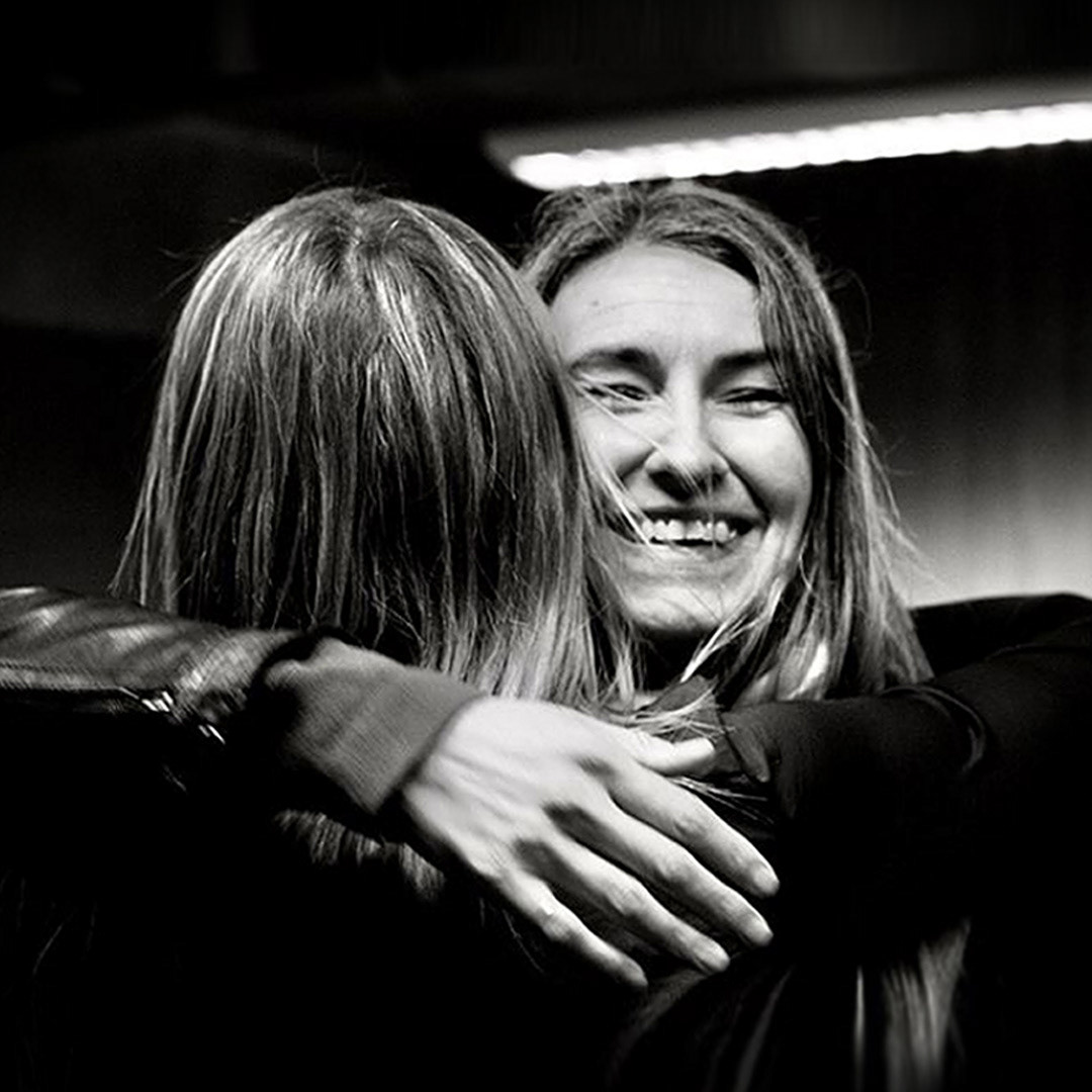
"It was such a pleasure working with you. We absolutely love it!"
"...And we're still in love with it!"
Emma Hughs & Hannah Gilyeat