Tayyaba need a bold impression to work on a large-scale screen for her global talks, as well as across web & social. She was wanting a modern, professional look — different from her previous logo which was a softer, more 'wellness' space style, rather than fitting with the corporate clients Tayyaba works with.


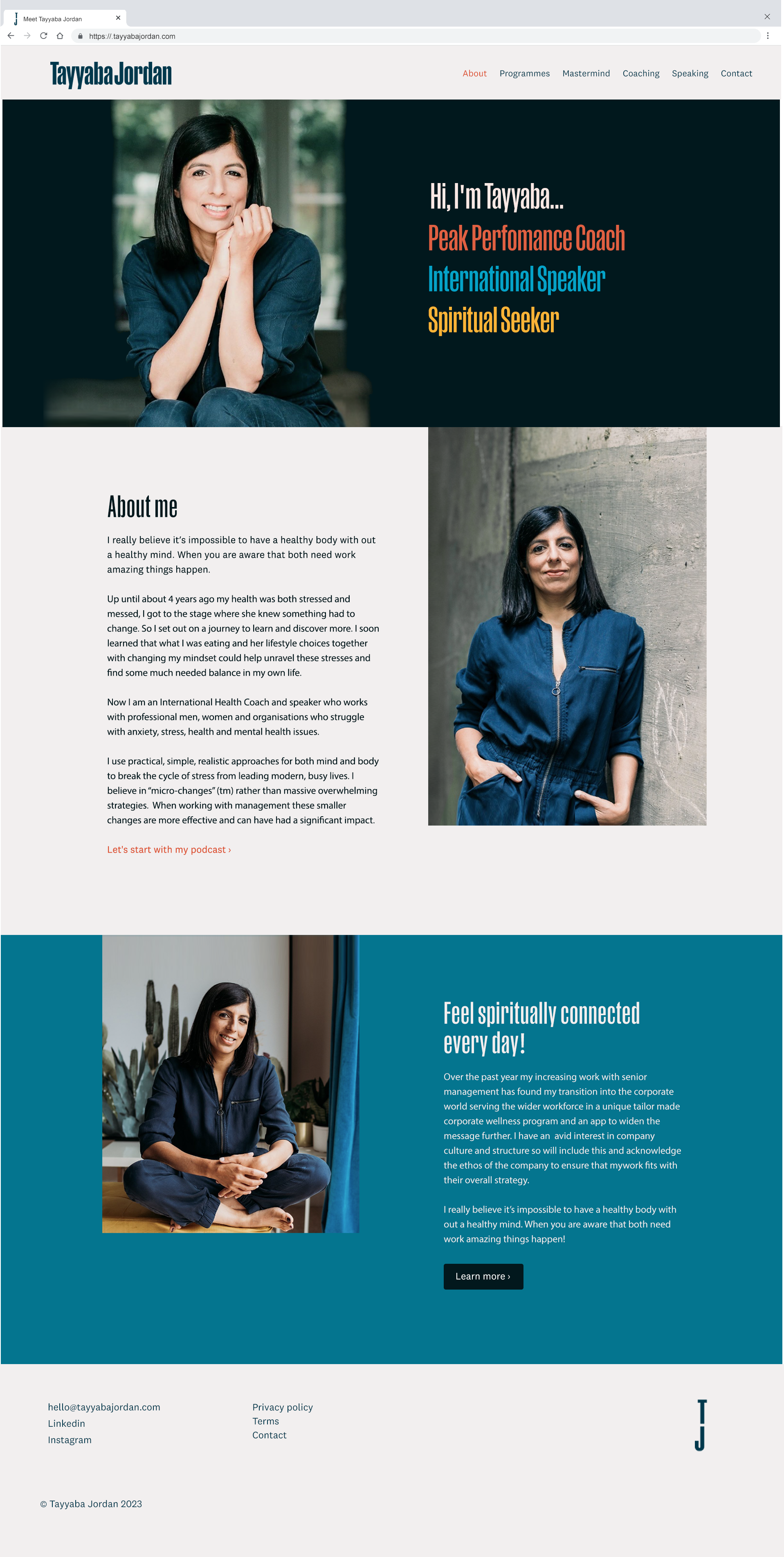
We decided on a bold, yet paired back look—using mainly deep teal with pops of accent colour and bold photography. Contrast is key—with deep tones used against bright and crisp type with a contrast of large & small elements. The refined look keeps the interest on the words & photos —with the odd eye-catching statement that stands out.
The main brand font "Manuka" gives a statement feel—having a strong presence with elegant notes (reminiscent of 70s feminist posters). Its condensed form works well for maximum coverage on the page. This is paired with fonts by the same foundry (Klim) for a congruous & bespoke look.