Adora is a health & wellbeing platform transforming the menopause experience for women and breaking down the taboo in the workplace.
I designed their logo & brand identity and currently work as designer & brand guardian for Adora, supporting in the application of their brand.
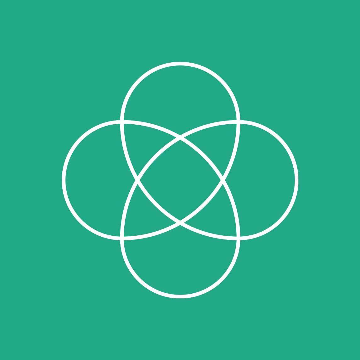
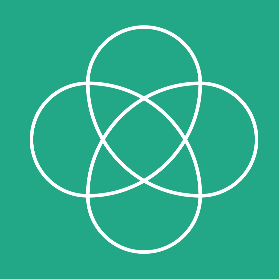
Logo design:
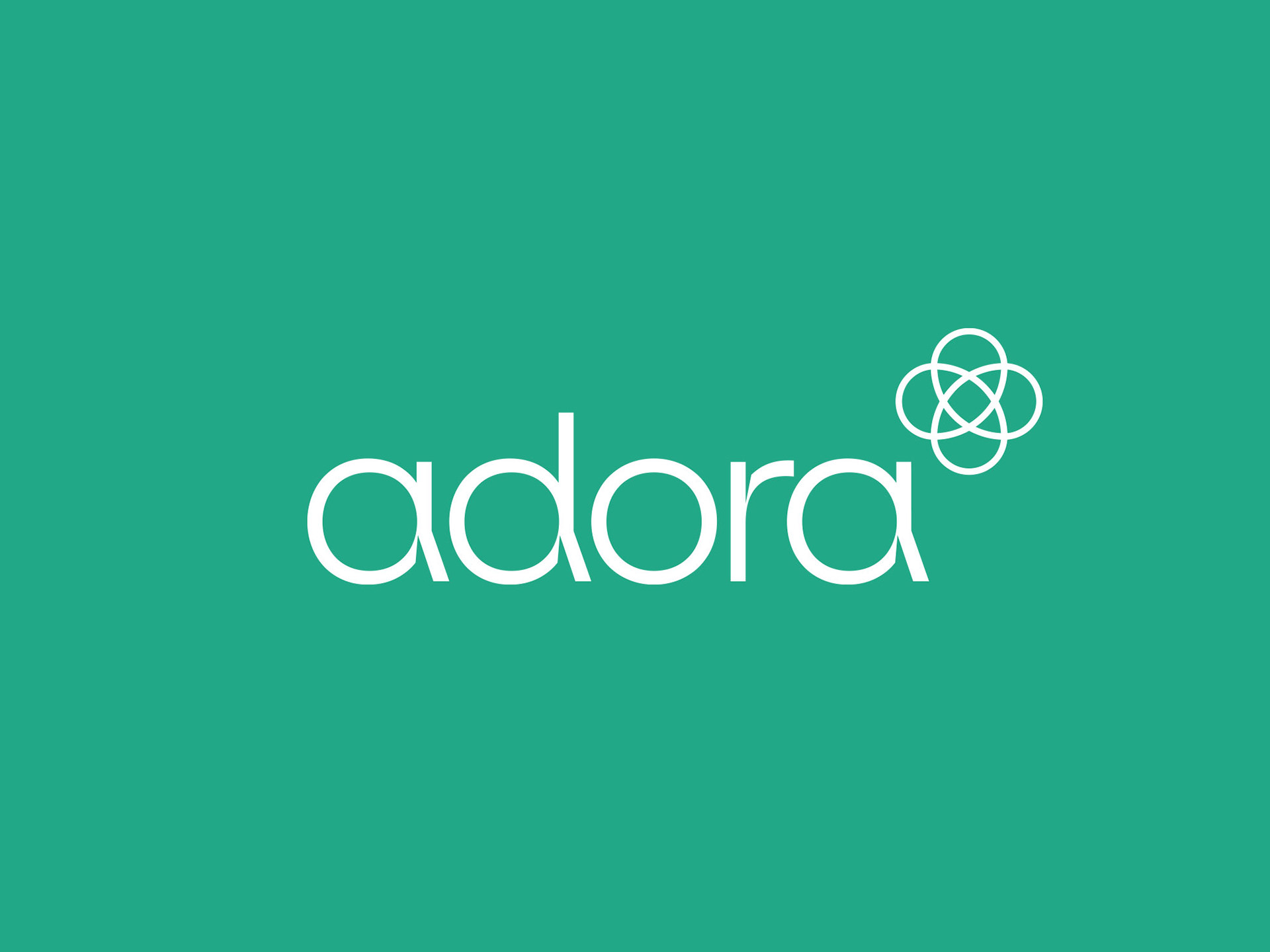
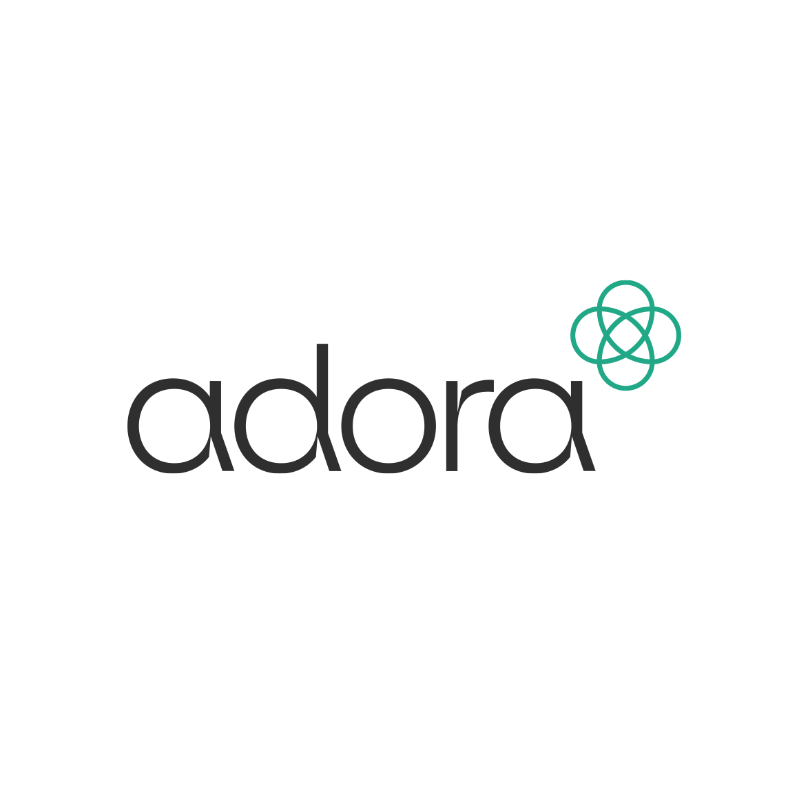
For adora, we wanted a clean, professional look—with a bit of a kick to it!
We noticed a lot of Women's Health brands had used fine serif fonts for their logos, alongside softer colours so we wanted to stand apart with a bold, modern look.
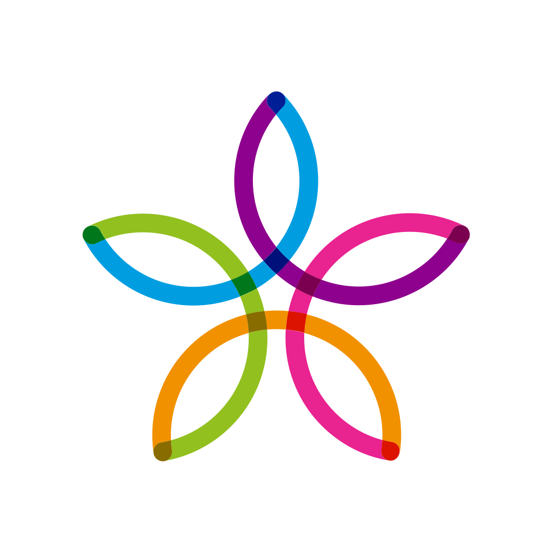
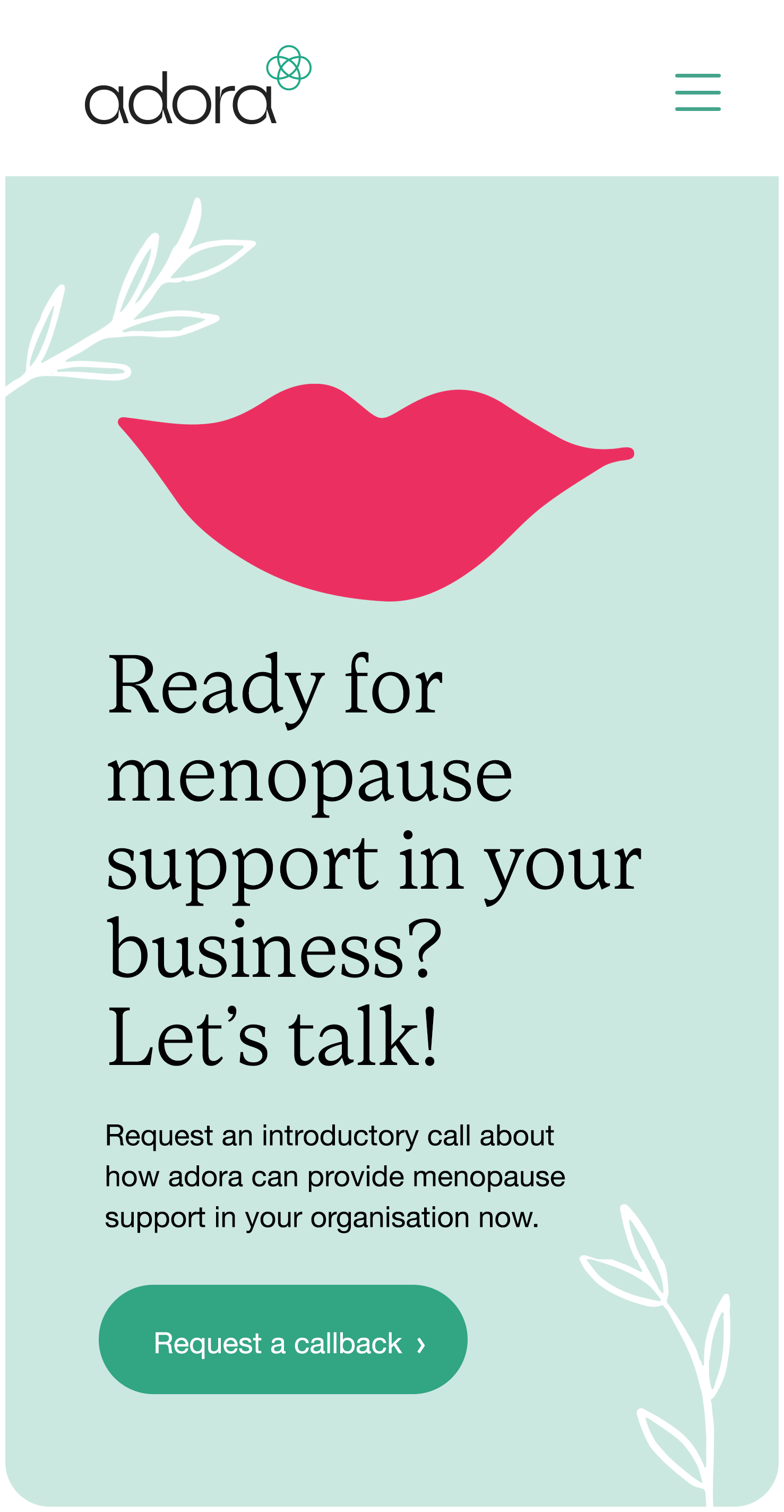
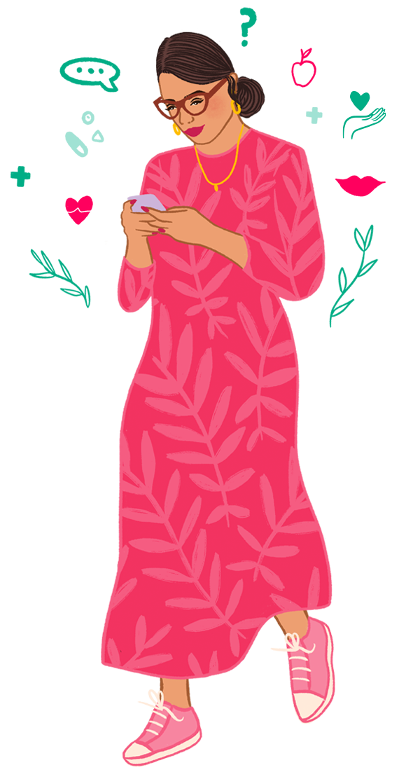
Therefore we opted for a concept combining geometric shapes with a modernist font and the logo marque forming a rounded health cross resembling a flower or atom — symbolising growth, connections, science & women’s health. To give a distinctive voice, a contrasting serif font is used for headline copy, alongside hand-drawn illustrations, to add a personalised look speaking to a female audience.
We opted for a bold colour palette, leading with bright teal & white, with crimson & yellow accent colours, to create a positive, uplifting feel, with the teal chosen because of it's association with healthcare.
Website design & build:
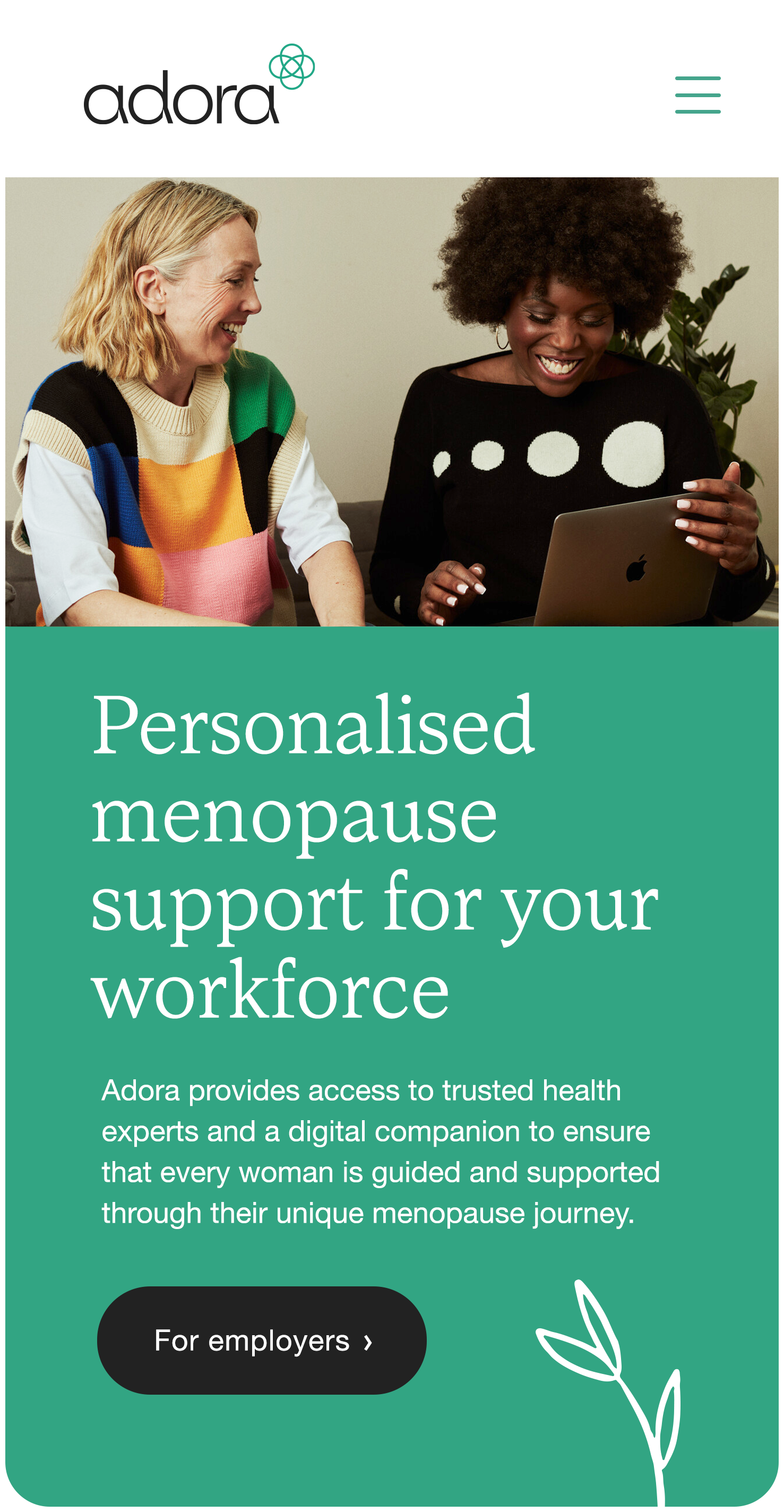


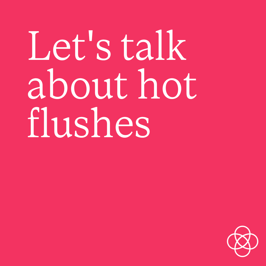
For the adora website, we looked at taking the brand bit further—how the symbol, colours and illustrative elements can extend across the brand creating a cohesive & distinctive look. I designed, built and currently maintain the adora website.
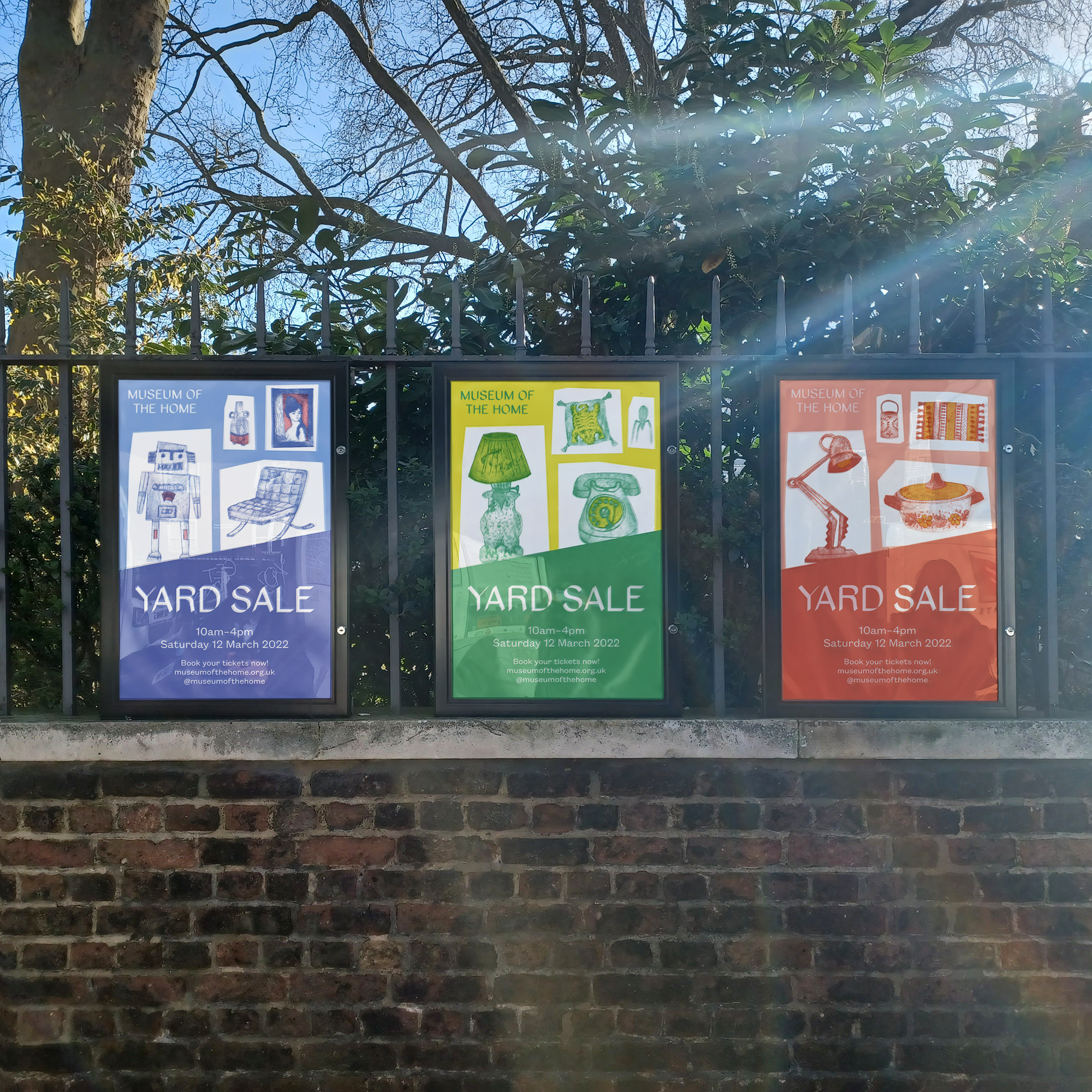
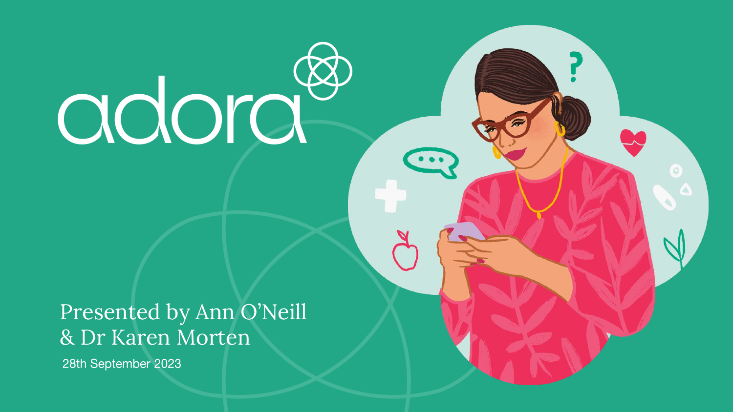
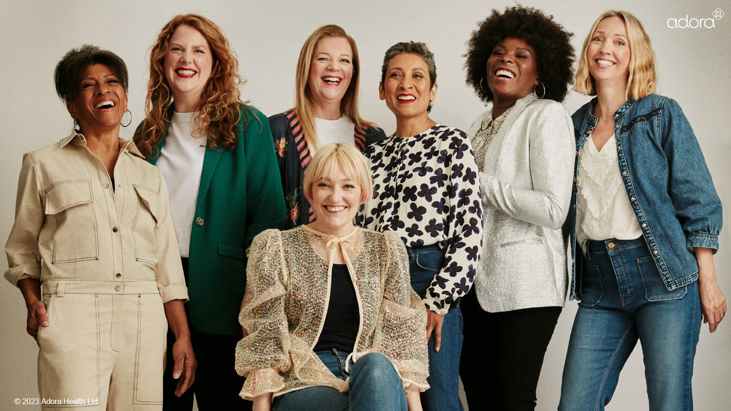
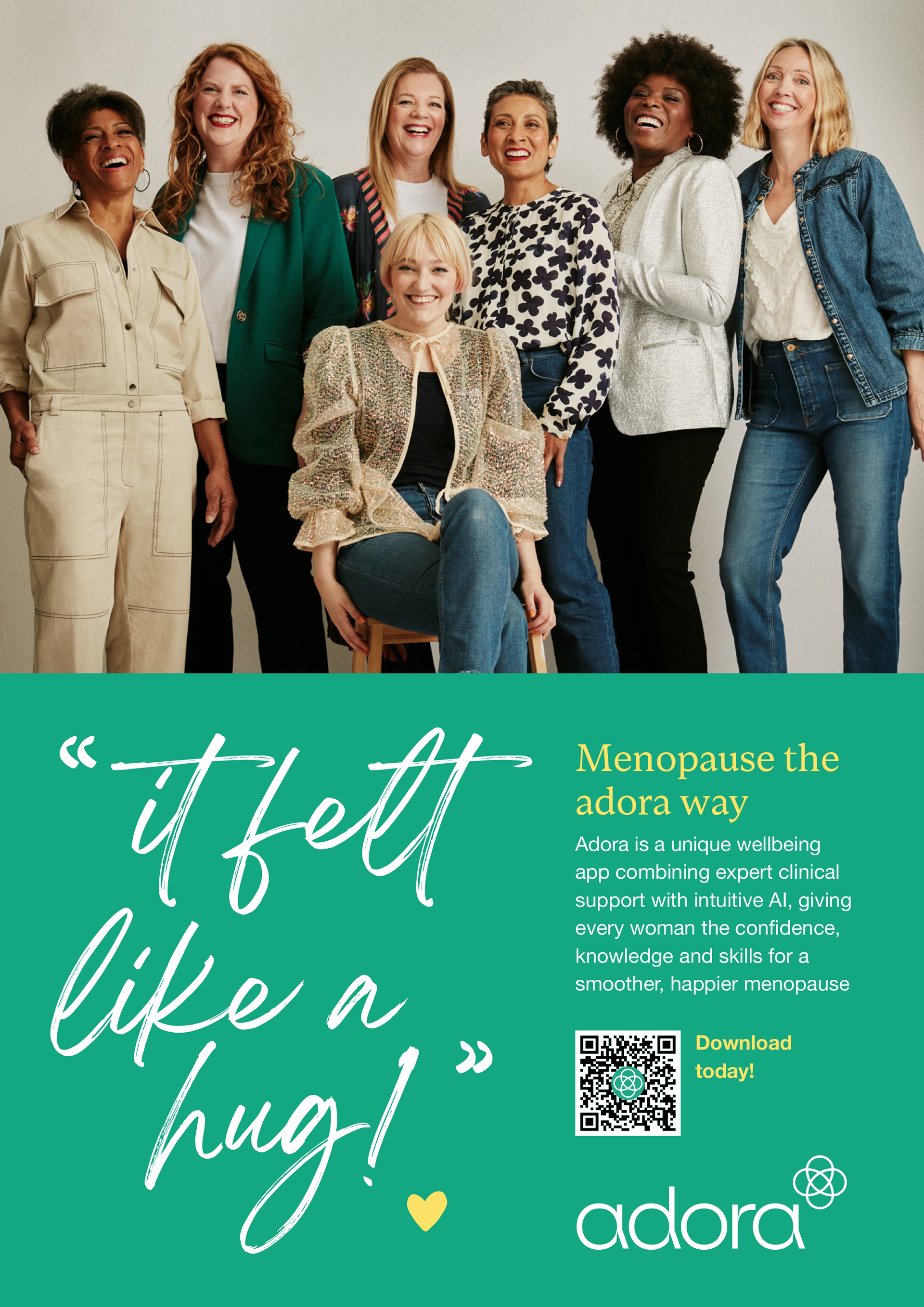
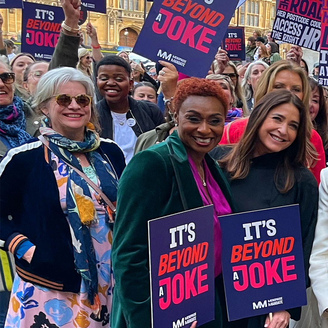
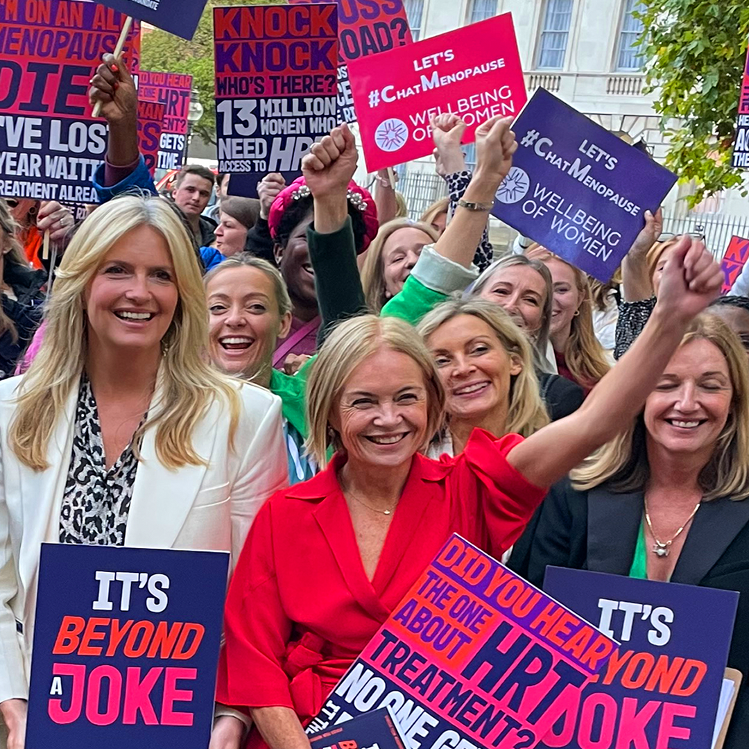
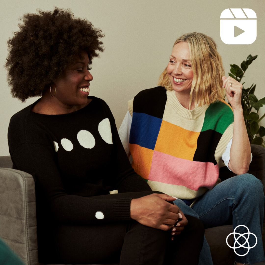
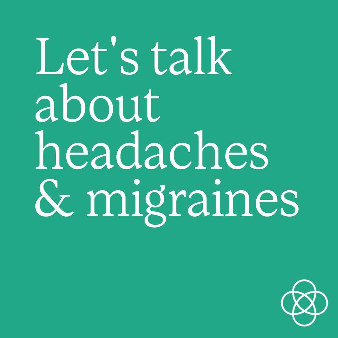
I've also designed posters, webinars, social graphics, presentation decks, commissioned illustrations and advised on photography styles for adora.
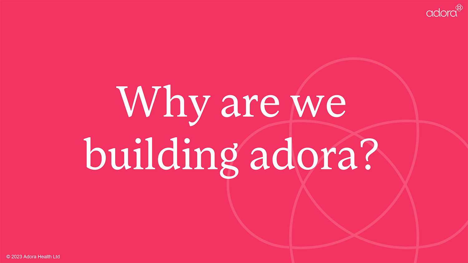
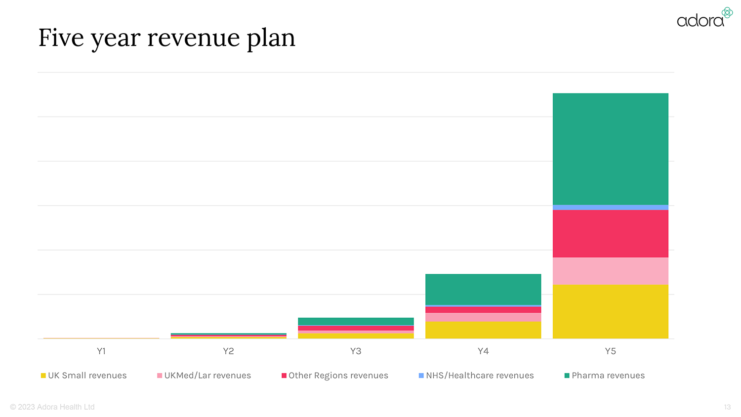
Presentation design:


Poster design:
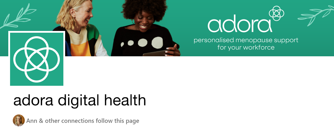
LinkedIn banner:
Instagram concept:

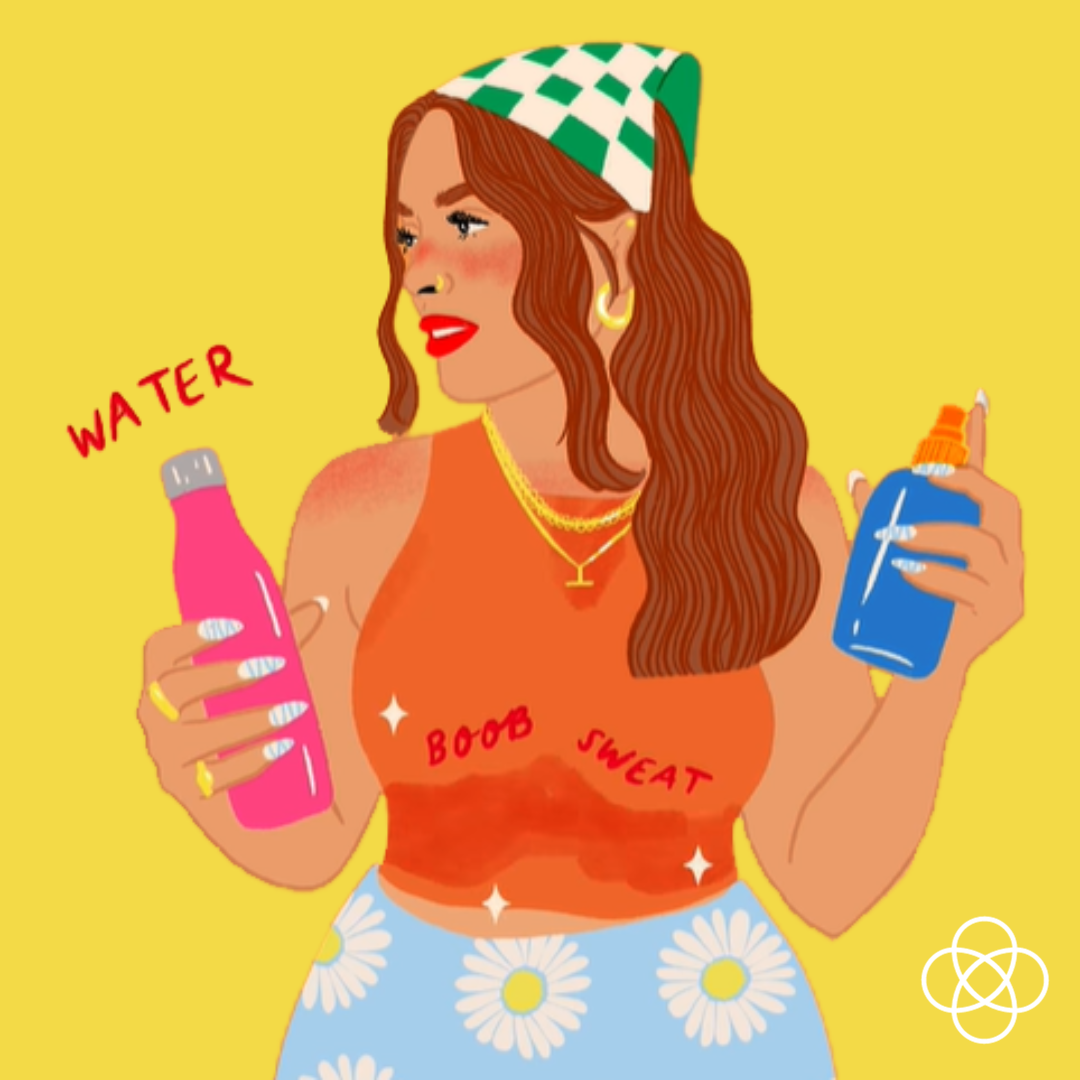

Commisioning of illustrations
(by Emmy Lupin)
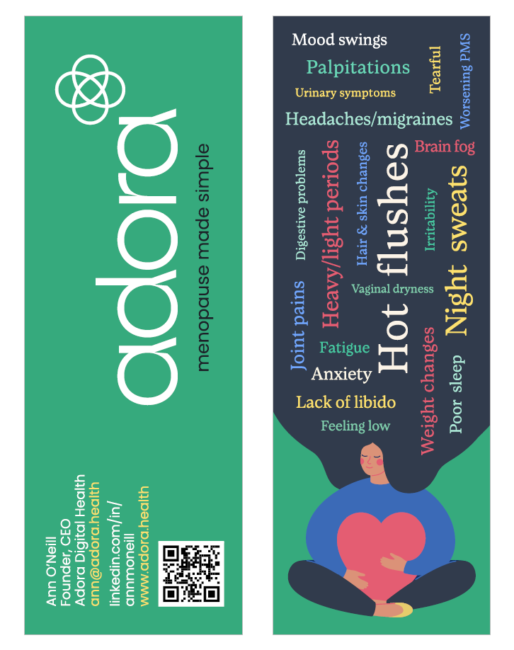
Business cards/Bookmarks
"Rebecca created a wonderful logo & brand for my new start-up Adora. It's really modern and looks like a proper grown up brand already. It's really smart."
Ann O'Neill, Founder Adora Health
Thank-you!
Big thanks to Ann O'Neill & the team at Adora for partnership on this project and Emmy Lupin for the beautiful illustrations!