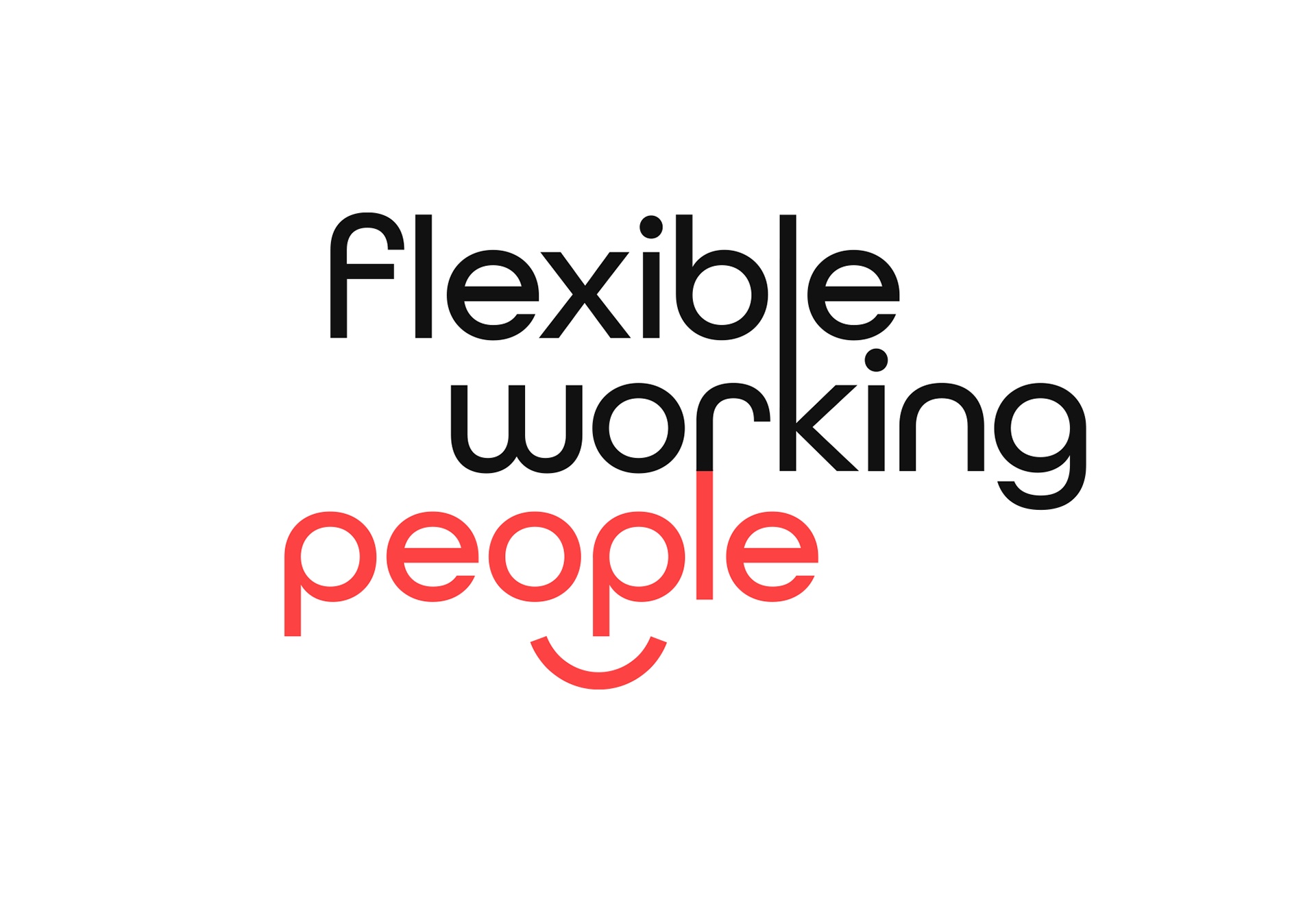
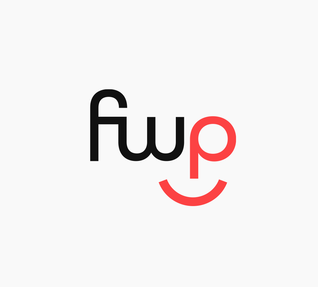
The brand for FWP focuses on the "people"—the amazing community of flexible working people Katy has brought together (through her Facebook group of 45K & website) changing the world of work. This is reflected in the brand through bringing out the word "people" in red, the smiley face and using lots of photos of people.

Instagram concept
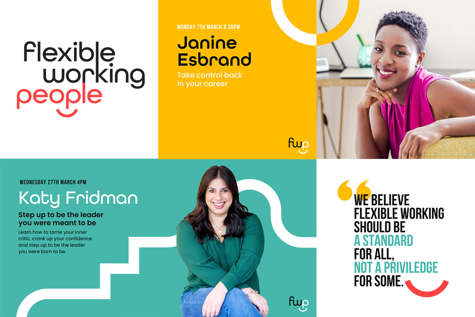
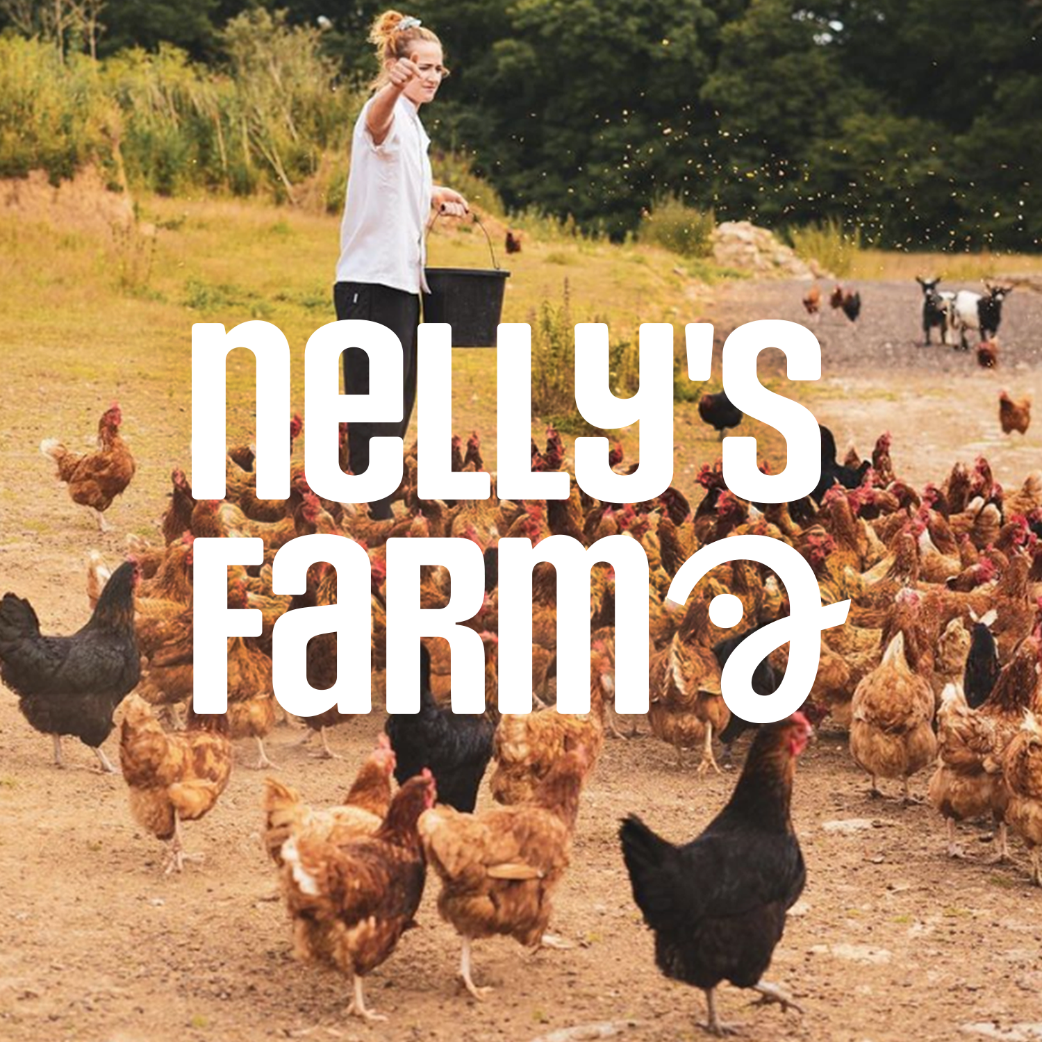
The linking letters & pattern create a flexible path, connecting in different ways—reflecting a career that is flexible & fluid, and creating a postive feel with the round smiley shapes, steps and open ended transitions.
I've worked on projects with Flexible Working People over the last 3 years, designing the website, job-search and social graphics.
"Rebecca has created a logo for me that I'm super happy with. I'm now going with her for all my brand & design work. Her designs are beautiful and she is so lovely to work with."
Katy Fridman, founder Flexible Working People
Thank-you!
With thanks to Katy Fridman for the great partnership realising her brand and Jo Chadwick on the brand strategy & marketing.