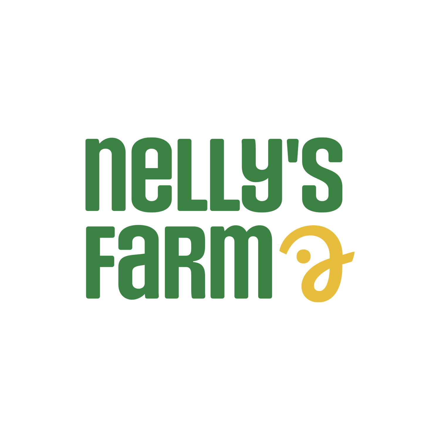

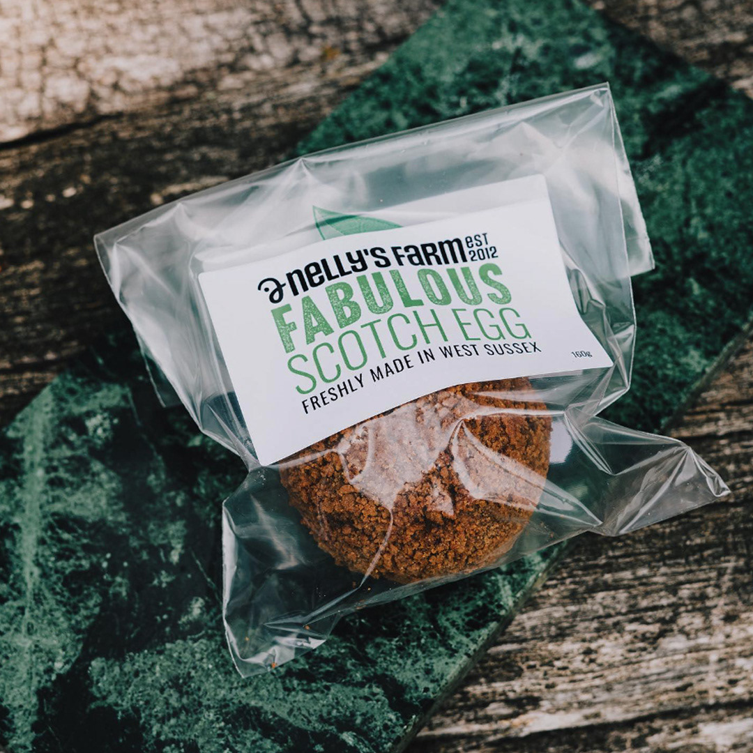
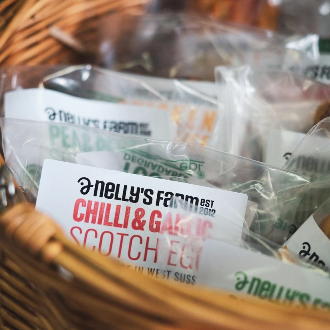
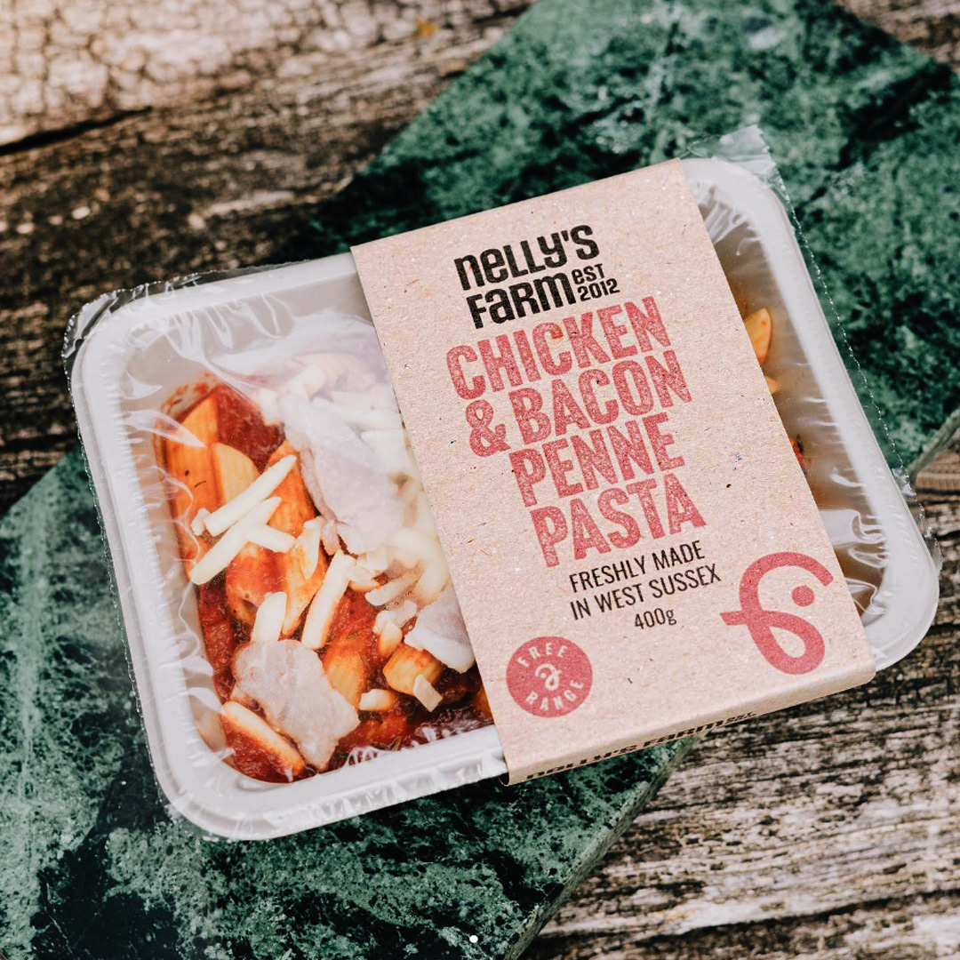
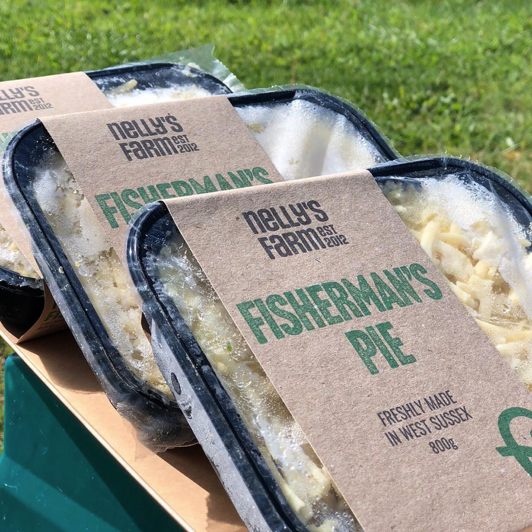
Nelly's Farm wanted their logo to be modern and flexible enough to work across their website & packaging. I designed the logo using a friendly, condensed font that also had smooth & rough variations to create a sense of texture on the packaging. The symbol is based on an "n" & "f" shape representing a chicken - as the freerange rescued chickens are a core part of Nelly's Farm.
Thanks Nelly's!
So great to work with Maria Budny & the team at Nelly's Farm and with Amélie Arras on the strategy & marketing.