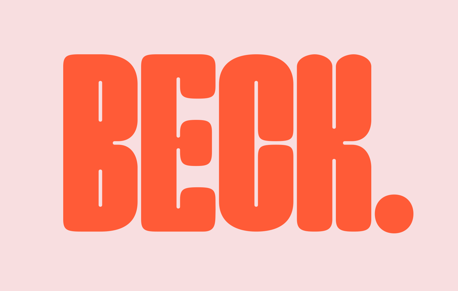
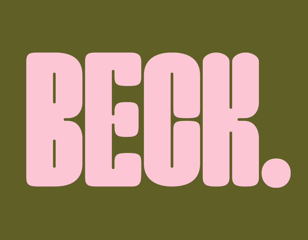

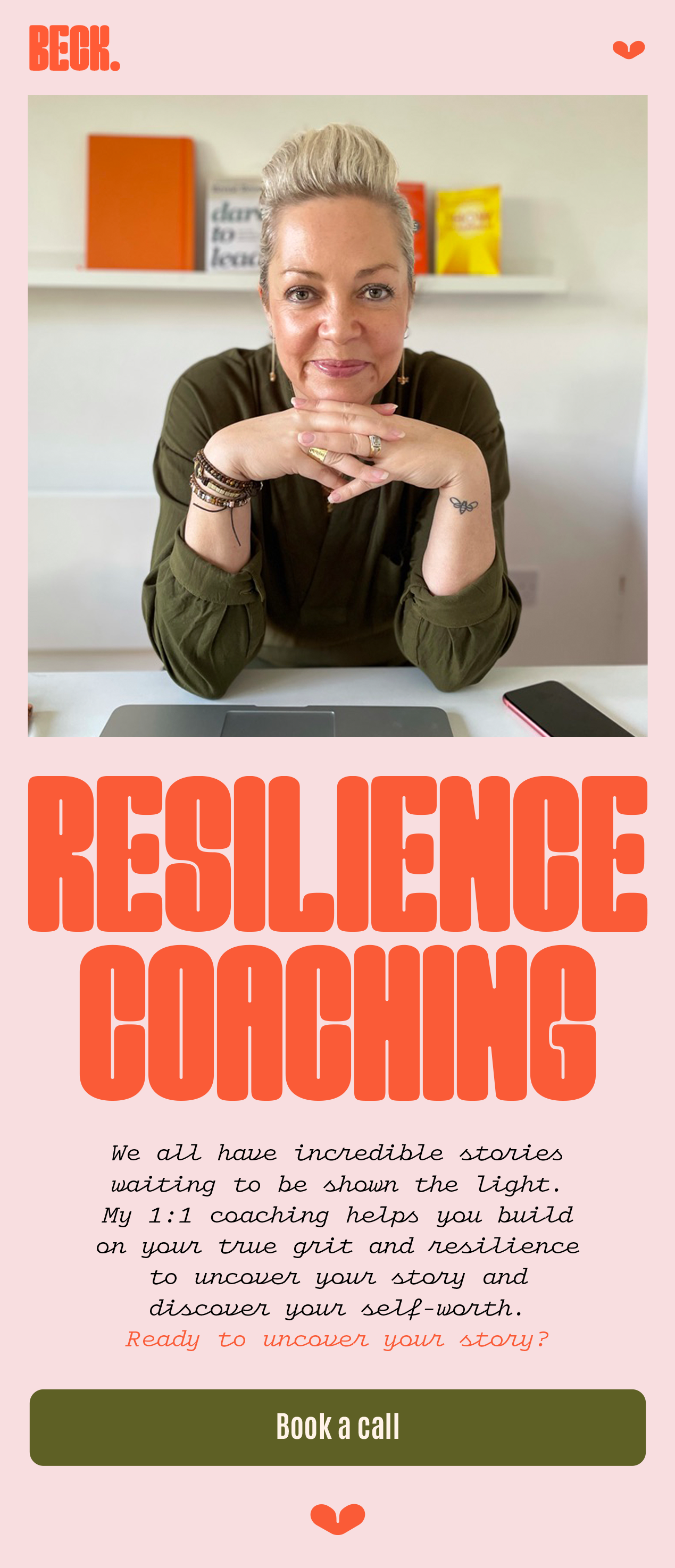
Beck wanted something really bold to stand out in the coaching space. We therefore chose a condensed font that had a bit of character to it—which works well really large making a statement. The theme of everything was 70s—being when we were born and influencing the type & colour choices. It was fun to work with such a bold & colourful look!