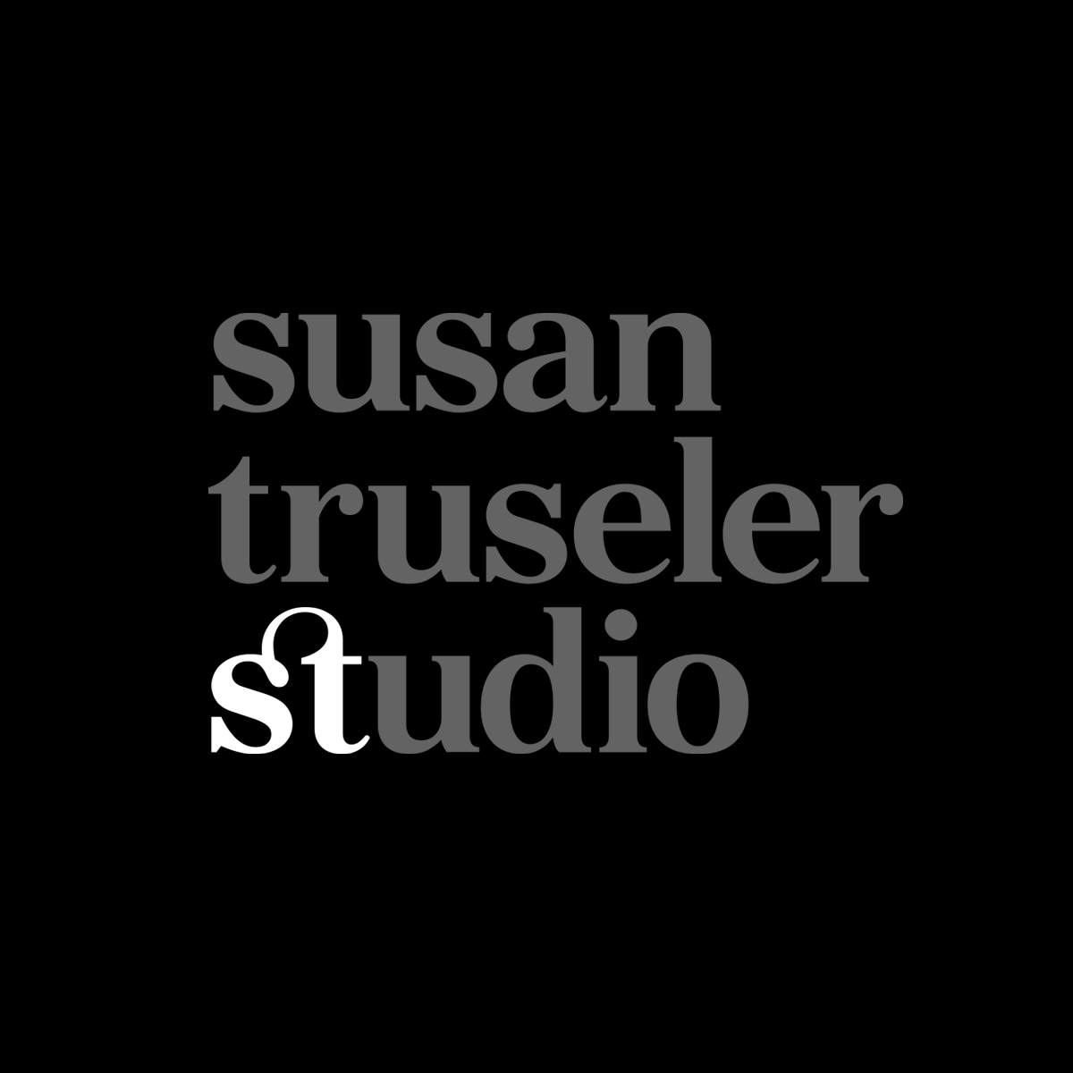

The idea for Susan Truseler's logo was "light" — being the essence of photography. When we chatted through and discussed the name of her business "Susan Truseler Studio" — I immediately picked up on the parallel between her initials "st" and "studio" so knew this had to be the symbol for her business. The logo was therefore developed using a strong black & white contrast for the light, with grey for the rest of the type — contrasted against her bright, colourful photography. The logo works well on the website (in a linear format) as well as small as a watermark, with the option of using just the symbol. The simple nature of the design lets the logo sit back and Susan's photography stand out.
"Working with Rebecca was a really smooth process. She really got me! Right from our first meeting I was clear of the direction, which was followed through with a beautiful, simple logo that works for everything I need it for."
Susan Truseler
