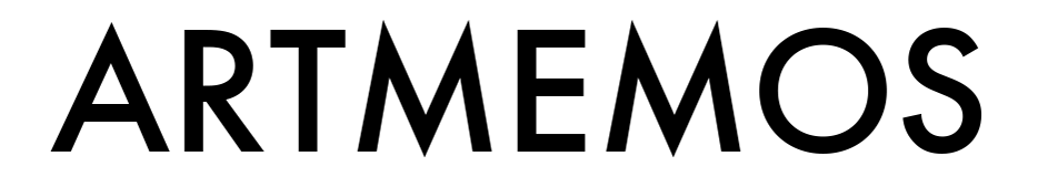

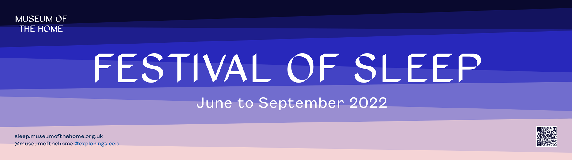
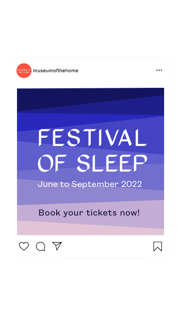
I wouldn't normally think about using straight angular shapes for the idea of 'sleep' - but we took this as a starting point (as it's the museum's brand element) and softened it by repeating the shape and using hues from soft pink to midnight blue to create dreamy tones—like waves of sleep or a sunset/sunrise—in this way it became the museum's distinctive & unique way of representing 'sleep' for the branding of their Sleep Festival.
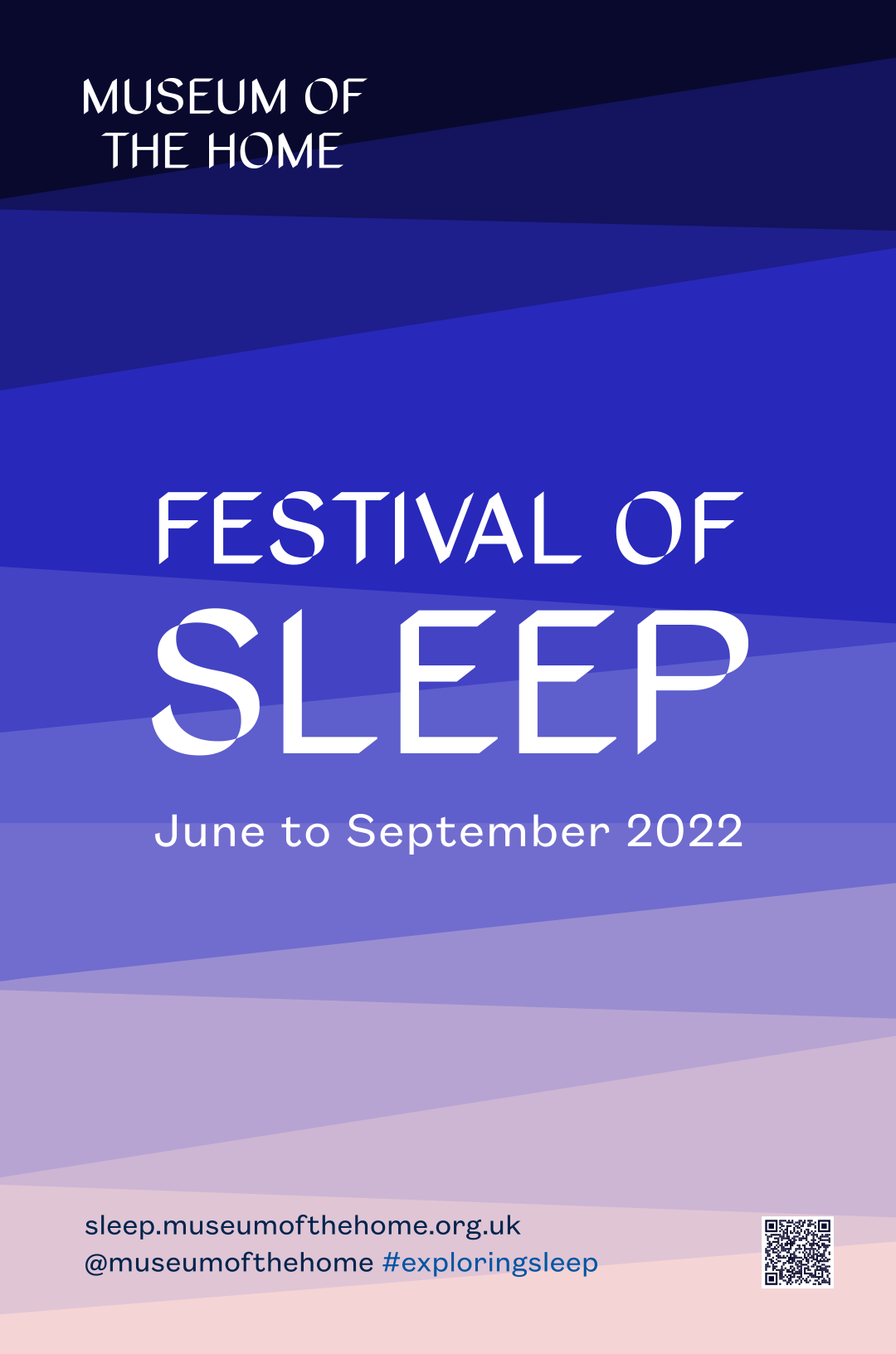
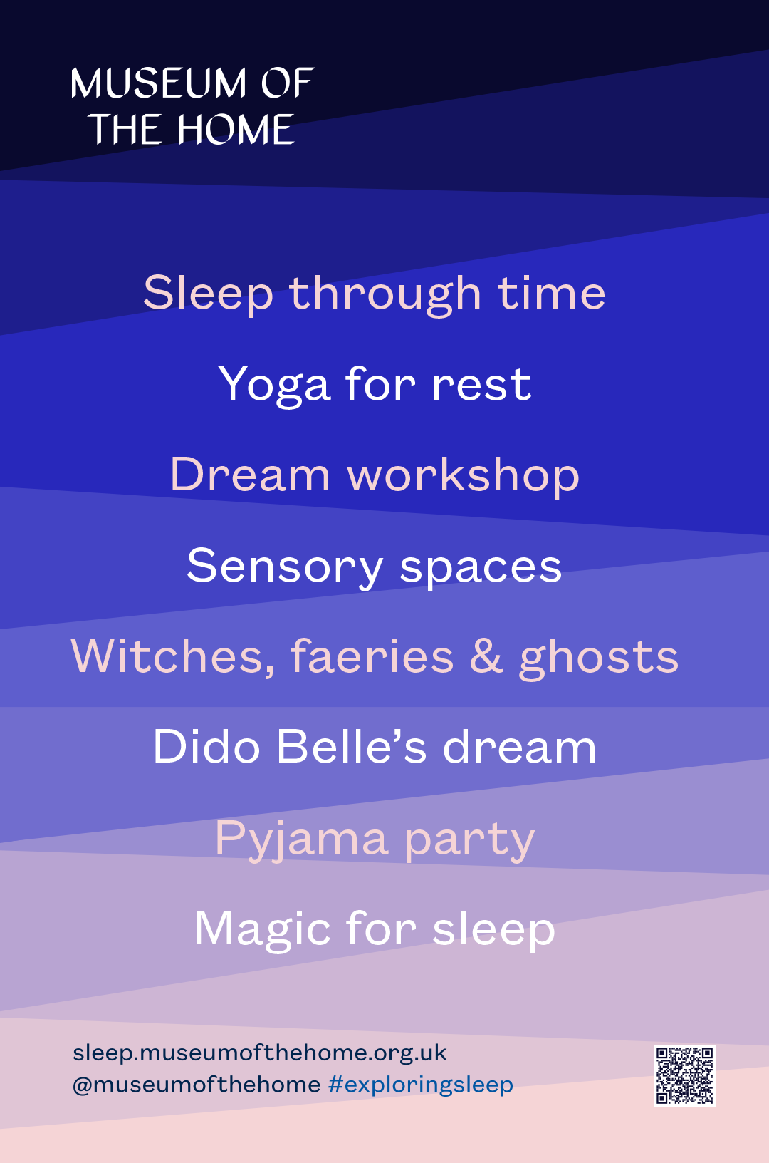

The campaign branding was designed to work across different formats - such as a linear banner, posters, on the web, display screens in the museum and alongside photography for events.


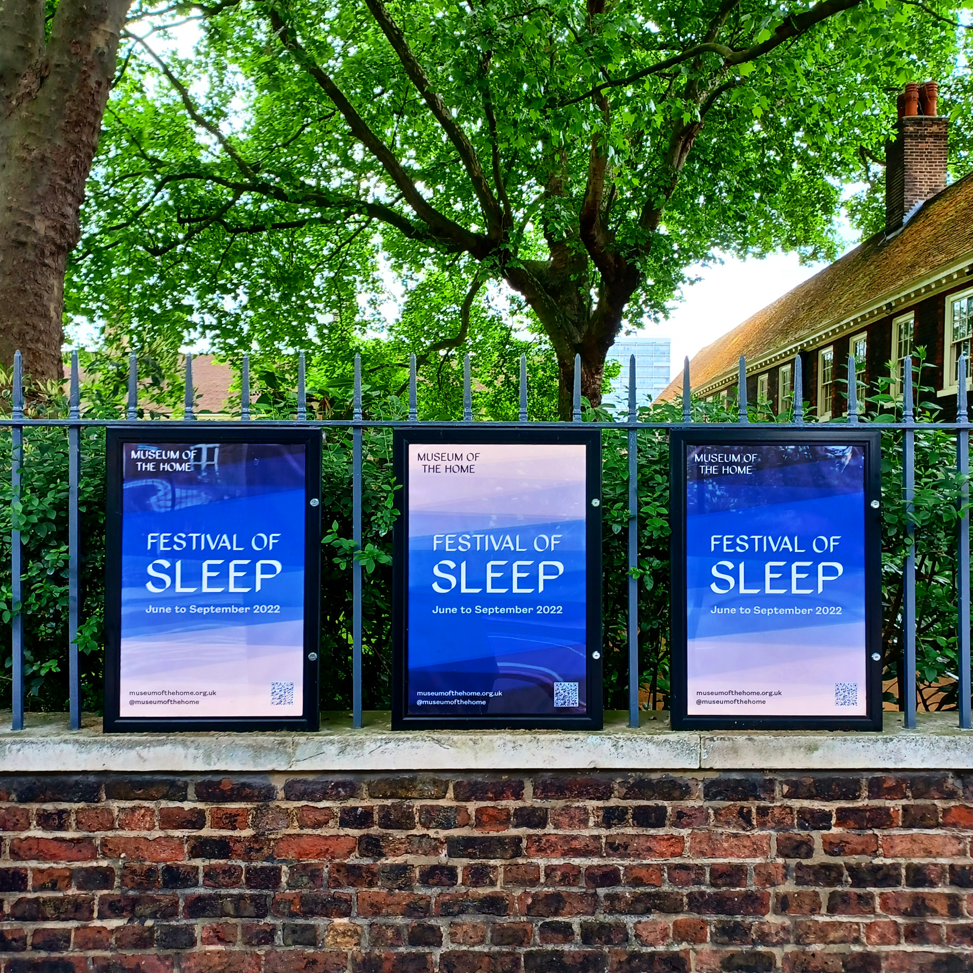
Railings posters outside Museum of the Home, Kingsland Road
"It's been a pleasure working with Rebecca over the last 14 months, from Yard Sale, to Sleep and Winter Festivals. Rebecca has been agile and shared her creativity with us to interpret various briefs for posters, flyers, display ads and more, which I have really appreciated. It's great to now see the designs up at the Museum and on the TFL network!"
Thank-you!
With thanks to the project team Harriet Maxwell & Melanie Stern from Museum of the Home on the campaign design & marketing.