I was looking through my old website archive and found a few blurry pages of the Armani website I designed back in 2003 and was quite surprised how contemporary it felt, so I decided to recreate the design here using the same grid format, colours & typography, I've just updated the logos as I don't have the old ones.
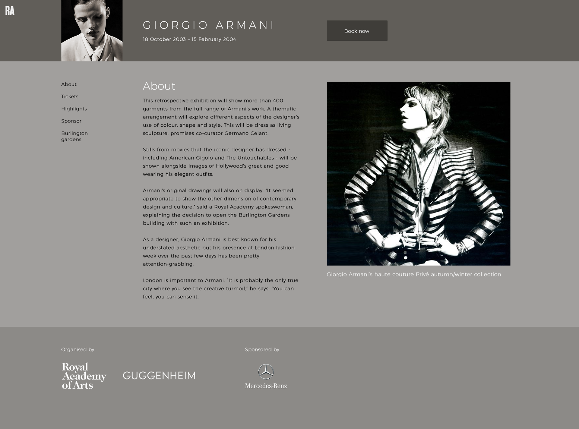
I find it interesting that we opted for a central grid system here (six years before it became popular) and kept the design very minimal and modernist, so I'm glad I don't feel it has aged.
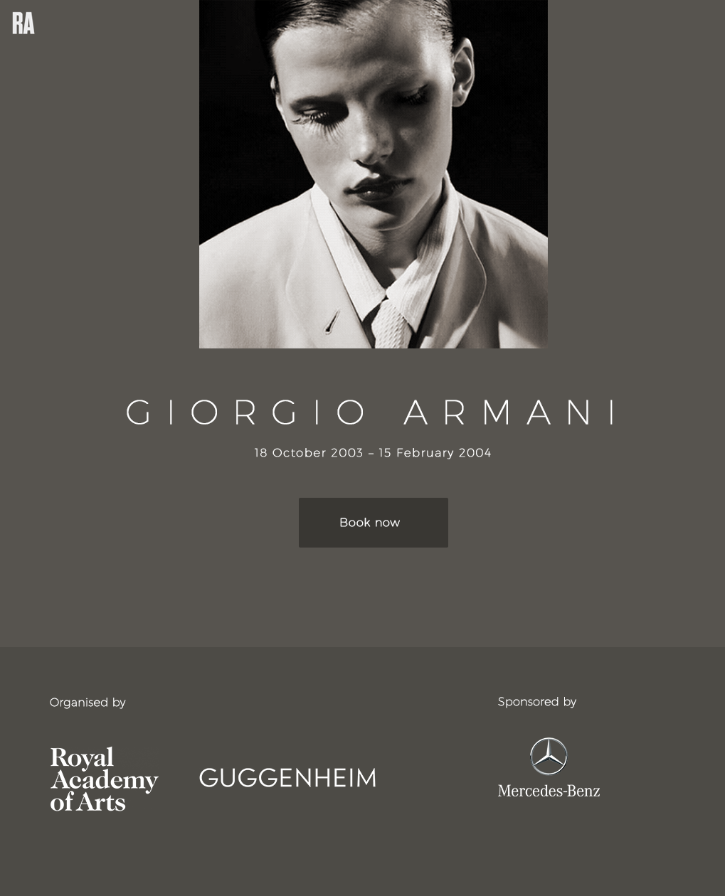
We decided to use a large image for the home page (then called the splash page!) which resized depending on screen size. This is of course commonplace now but was unusual for the time.
The levels pages followed the same underlying structure of the main RA website - for design consistency as well as use of the same code base. At the time the "micro-site" was very popular - so we went against the grain here and aligned the exhibitions with the rest of the website.
Giorgio Armani
Website, 2003
Client:
Giorgio Armani & The Royal Academy of Arts
Giorgio Armani
Website, 2003
Client:
Giorgio Armani & The Royal Academy of Arts
Design & art direction:
Rebecca Smith
Project management:
e-2.org
Rebecca Smith
Project management:
e-2.org